Bab al Hara
Reimagining the visual identity of one of the Arab world’s most recognisable television series.
00
The Collaboration
After twelve seasons, Bab Al Hara had become more than a television series. Its visual identity had become deeply embedded in the cultural memory of its audience. As the series approached its thirteenth season, its creators partnered with HOM to explore how its identity could evolve without losing the character that made it instantly recognisable. Our role was to rethink the series’ iconic Arabic wordmark and create a new typographic expression that could carry the legacy of Bab Al Hara into a new chapter.
The Creative Direction
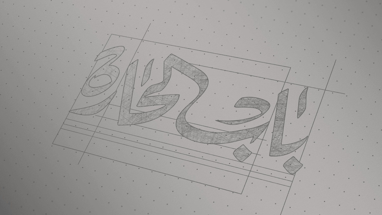
The challenge was one of balance: how do you evolve an identity that is already part of popular culture? HOM approached the redesign through Arabic typography, drawing from the visual language of the series and the historical character of its world while introducing a more contemporary sense of form and composition. Rather than abandoning the identity audiences already knew, we looked for ways to distil its most recognisable qualities and reinterpret them through a sharper, more refined typographic system.
The Work
Work
The Result
Result
The rebranding of Bab al Hara was ignited by the show's creators' collective commitment to storytelling and their understanding of the need for visual evolution. Working on the logo, we acknowledged the series' important role in modern Arabic television drama and aimed to rejuvenate its visual identity to maintain viewer engagement. The creators envisioned a partnership that would breathe new life into the series, marrying modern design with its rich cultural heritage, without losing the essence that has made it a staple in many homes.
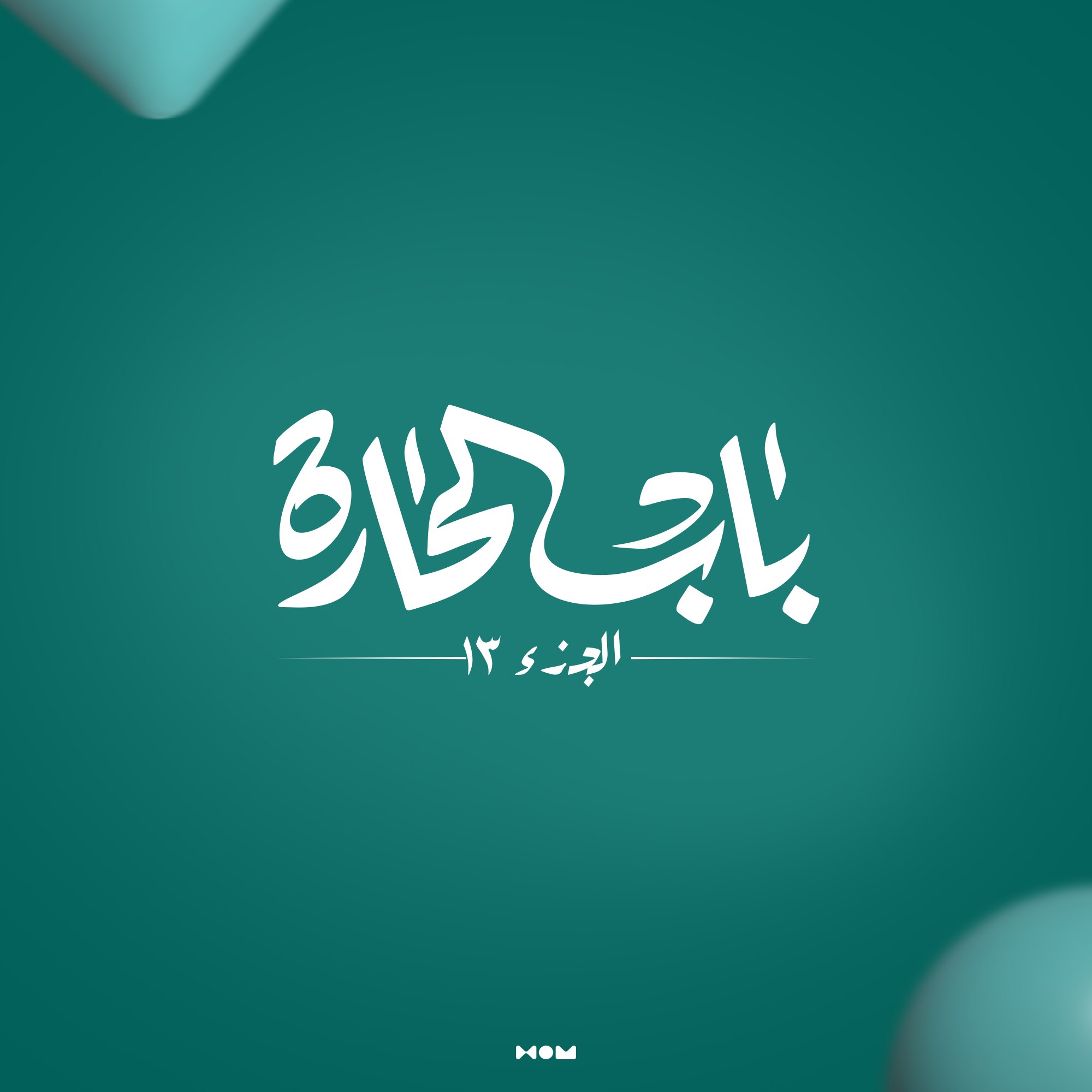
Fueled by their aspiration, our team at HOM combined the talents from design specialists, typographers, and cultural historians. With our knowledge in Arabic typography, historical aesthetics, and modern design principles, we came out with our best result. Utilizing this wealth of information, we crafted a modernized Arabic typography logo that encapsulates both the series' historical context and its contemporary narrative.
Since its unveiling, the rebranded logo has had a transformative impact on the series' viewership. Fans, both new and longtime, have warmly received the fresh visual identity, noting how it invigorates the storytelling experience without erasing its cultural roots. The redesigned logo not only freshens up the series but also deepens its engagement with its audience, enriching their emotional and cultural connection to the show. In effect, Bab al Hara has not only preserved its heritage but has also ushered itself into a new era of visual storytelling, maintaining its relevance in an ever-changing media landscape.
01
A Snackify box filled with an assortment of personalized healthy snacks, curated to match individual dietary preferences.
02

A satisfied customer enjoys a delicious and nourishing snack from their Snackify subscription, knowing it aligns perfectly with their dietary needs.
see also